

Turning a cash register into an app
Brief: It was time for one of the biggest shoe stores in Sweden to replace their 15-year-old cash registers with new technology, due to their slow and limited performance. But what would it be?
Role: Lead UI/UX Designer
The challenge
We determined three main challenges:
Identify the real reasons why the current machines aren’t good enough.
Help and decrease the stress level of employees
The client wishes to integrate e-commerce into the physical store
Process
This is the process my team and I followed in this 3-month project. Let’s go through each step.

01 : Research, Scoping
Learning the tools, the personas, the scope
It was important for us to highlight the research phase, and have it done before scoping the project. We started by going to the store and learning how the cash register works today. Once we learned the tools, we started interviewing co-workers and observing how they interacted with the customer. We did this for a week in big, busy stores, as well as small ones. The insights we gathered were extremely valuable to the brand and, after a few brainstorming sessions together with the client and some technical architects, we decided to explore the idea of replacing cashier machines with phones and a custom-designed app. The idea was wild, and the client agreed to give it a try.

Single-handed interaction
Replacing the cashier machines was a cool idea, but it came with its own challenges. The biggest challenge was the mobility of the phone. It meant that the co-workers could now check-out a customer and finalise a purchase from anywhere in the physical store, meaning there was no need for a “check-out desk” anymore. This also meant that co-workers would hold the phone in one hand and use their other (free) hand to hold and scan a shoe. Yes – the entire app needed to enable single-handed interactions, and that’s where the second part of our research started. This time, we started to look into how “the big players” had solved this challenge, and below you can see a few examples of the things we found.

The outcome of our research was that we needed to design an interface where all controls are at the bottom of the screen and reachable bythumb, while the rest of the screen is used to display information only. (There were, of course, many other areas that we researched, but these were the most relevant to this particular case study.)


03: Design / Prototyping
Wireframing, IA, and prototyping
After a month of research and ideations, it was time to dive into the solution. We started identifying features, and set up a strategy for the MVP, starting with low-fi wireframes and simple prototypes.
After testing different concepts and prototypes, we started to gradually add more colours and make the prototypes look like a final product. Of course, we had sync meetings regularly with developers to make sure our crazy ideas were doable. For this project, we used Flinto and Invision for prototyping and Sketch for UI design.


04: Product / Delivery
Final design
And finally, we had the first version ready for development. (Are you interested in seeing more screens, and understanding how we solved the single-handed challenge and tons of other challenges? I’m happy to show you more on a private call!)
Delivery to developers
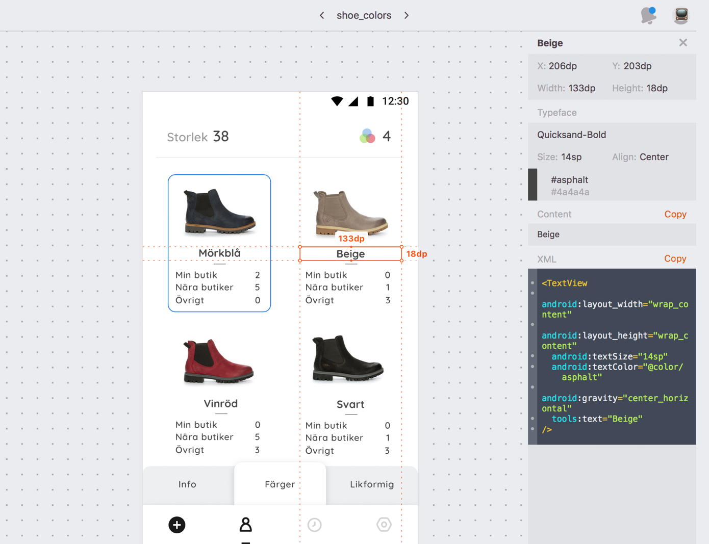
To ensure a pixel-perfect result, we use Zeplin to transfer the design and all assets over to developers.
05: Feedback
We’re not done here. Soon as the product is released, we’ll observe the development and see how the solution works in real life. Then we need to go back and keep improving.
