YP Club: Branding and Art Direction
The brief
As "Dubai Young Professionals" expanded to new cities, a global rebranding was necessary to align with the company's new vision.
Moodboard
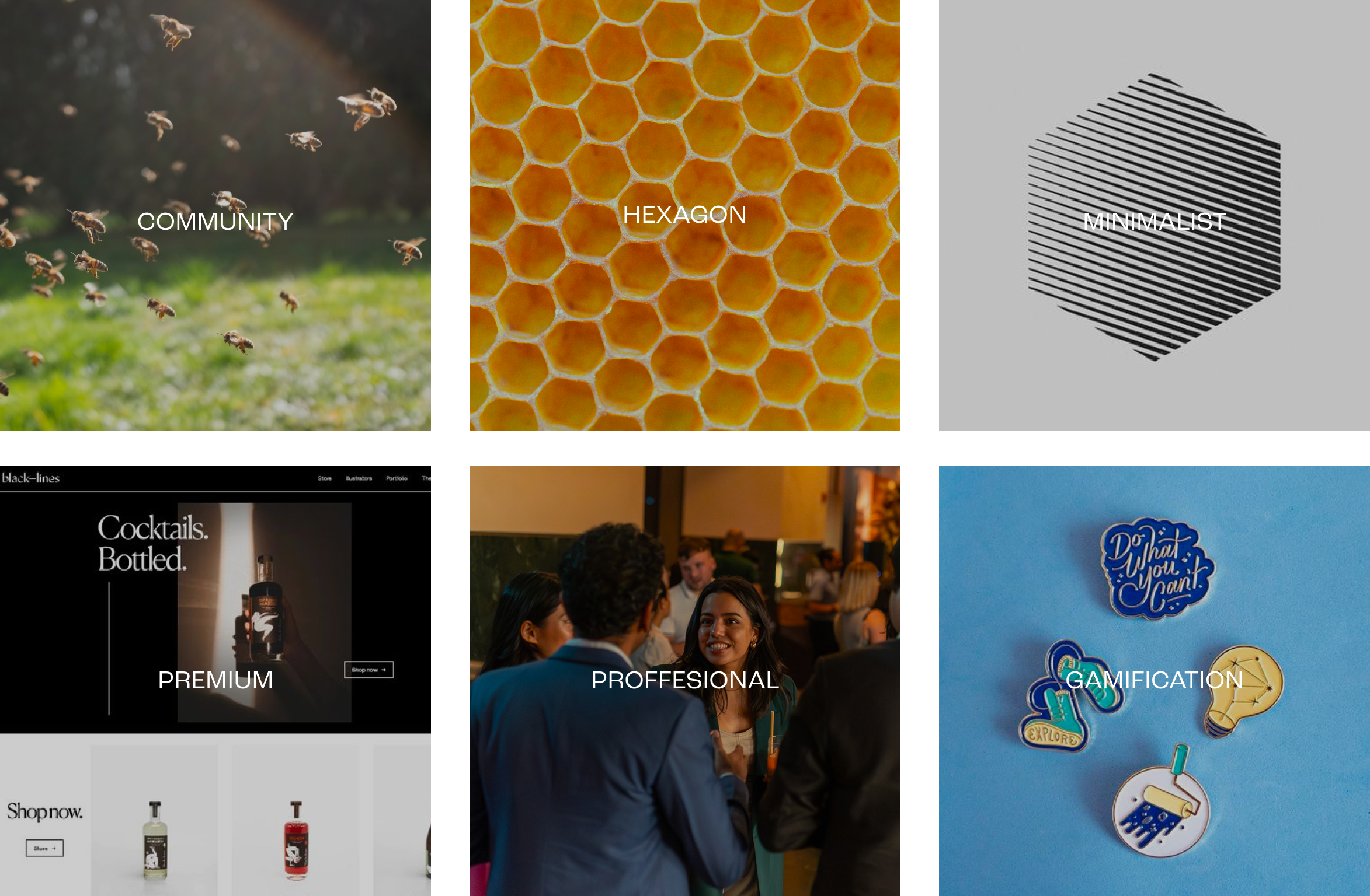
The concept of using bees as a symbol of community emerged early in the process, guiding the art direction. We aimed for a minimalistic and premium aesthetic to emphasize the exclusivity of the community. Gamification played a crucial role, and we explored the idea of incorporating various levels with distinct badges.
The Name

The name "Dubai Young Professionals" no longer suited the brand's expansion into new cities. We explored various options, including using the Arabic name for bee, "Nahla," but ultimately decided on "YP Club."
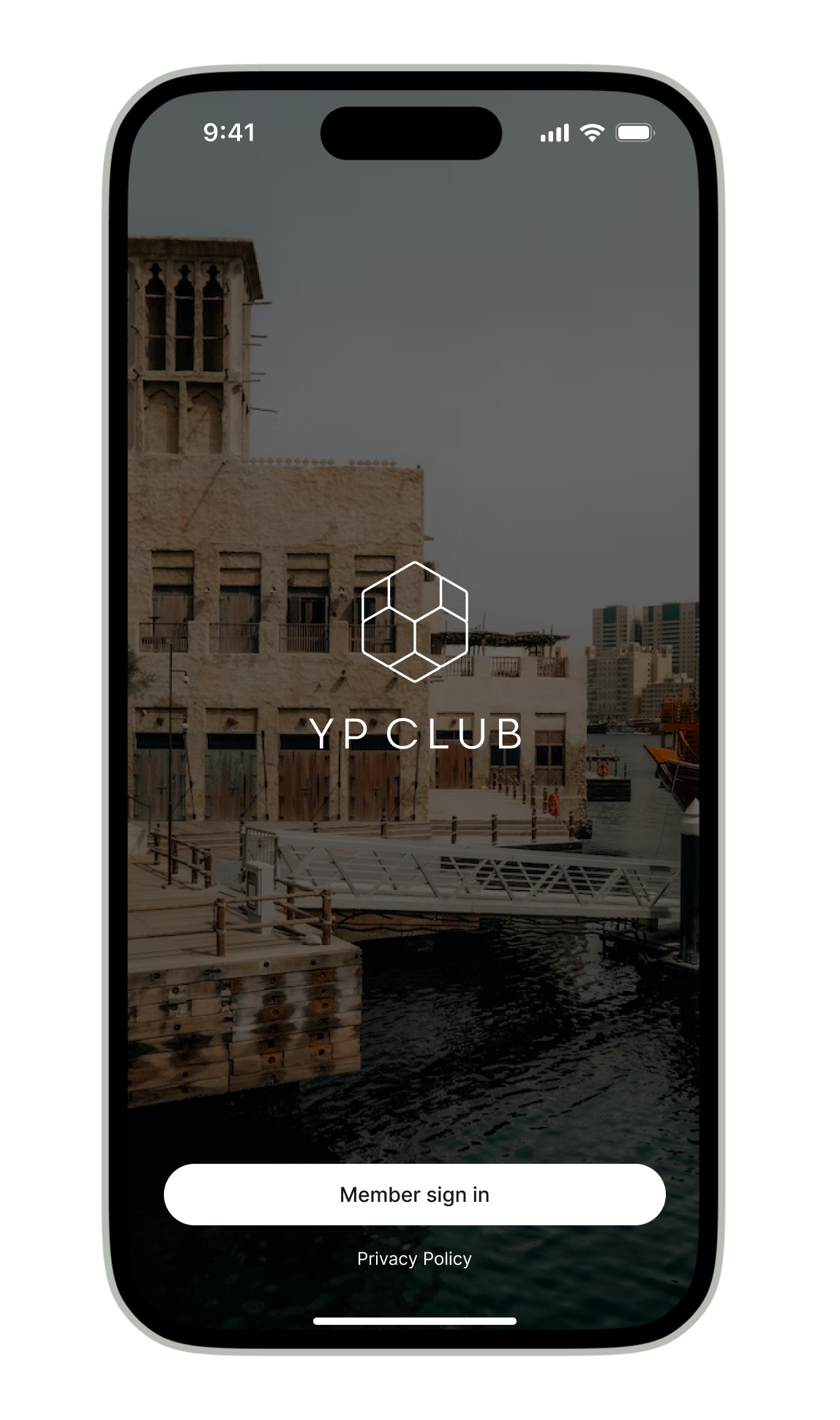
The Logo

A minimalistic yet distinctive symbol was created, representing a beehive. The hive serves as the community where the members, or "bees," gather and produce their honey. Given the prevalence of logos with a hexagon-shaped hive, the challenge was to design a unique yet minimalistic logo.
The Colors
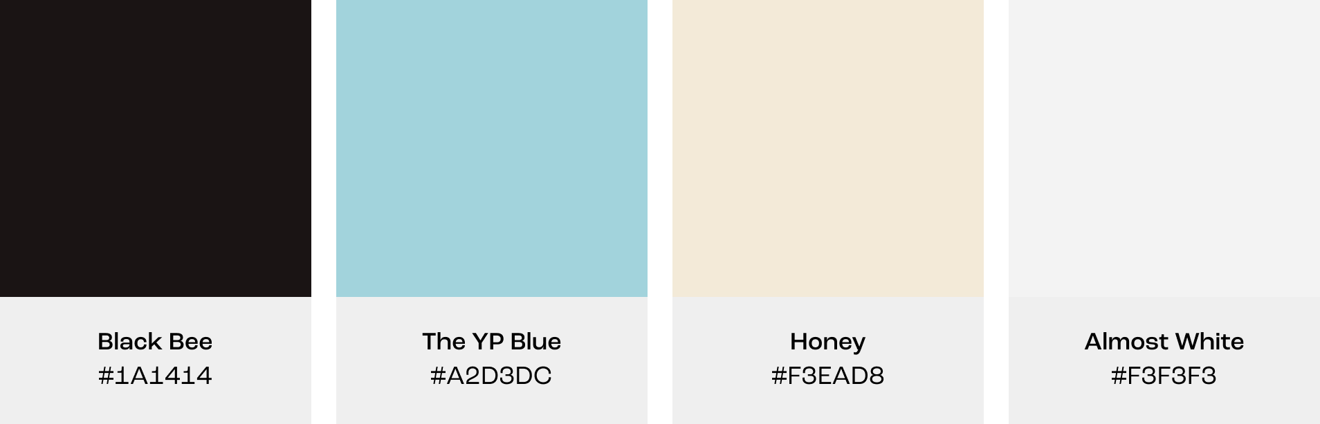
We aimed to maintain a premium appearance with a black and white color scheme, incorporating blue and beige as accent colors for badges, buttons, and other details.
Typography
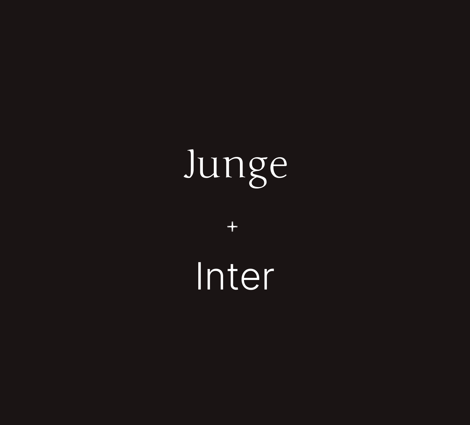
Junge was chosen for its exclusive, premium appearance, serving as the voice of the members. As a guideline, it should be used exclusively in community contexts, such as quotes or member names. Meanwhile, Inter, a simple and readable font, is designated as the default font.
Brand Book

The brand guidelines were condensed into a comprehensive digital brand book.
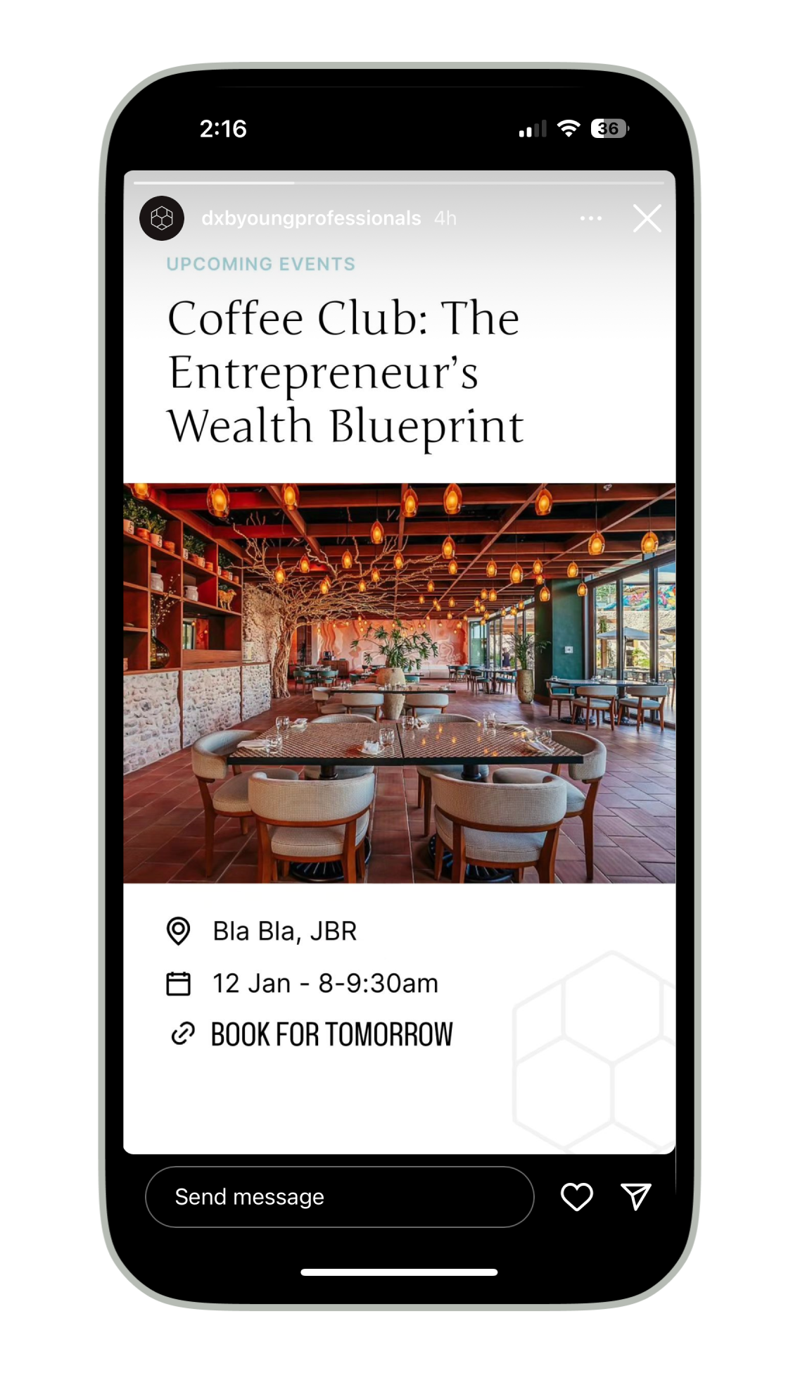
Art Direction for UI

Here, we explored different UI directions and we can observe the integration of the brand guidelines in the UI—hexagon-shaped profile pictures symbolizing a part of the hive, color accents for small details, and the use of Junge font for member names.
The winner


Gamification Badges
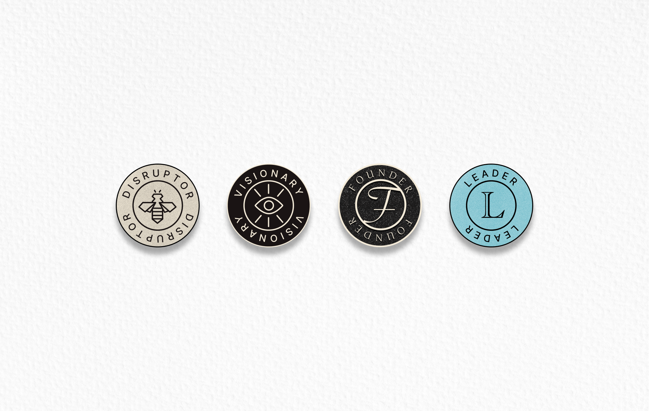

Badges serve as incentives for members to engage, collect points, progress to the next level, and attain new badges, adding a playful touch to the premium aesthetic.