AQUI: Branding and Art Direction
The brief
Crafting a brand identity to convey a fashion designer's vision and narrative across various channels. This bold fashion brand is designed to empower women to express their untamed feminine energy.
Moodboard
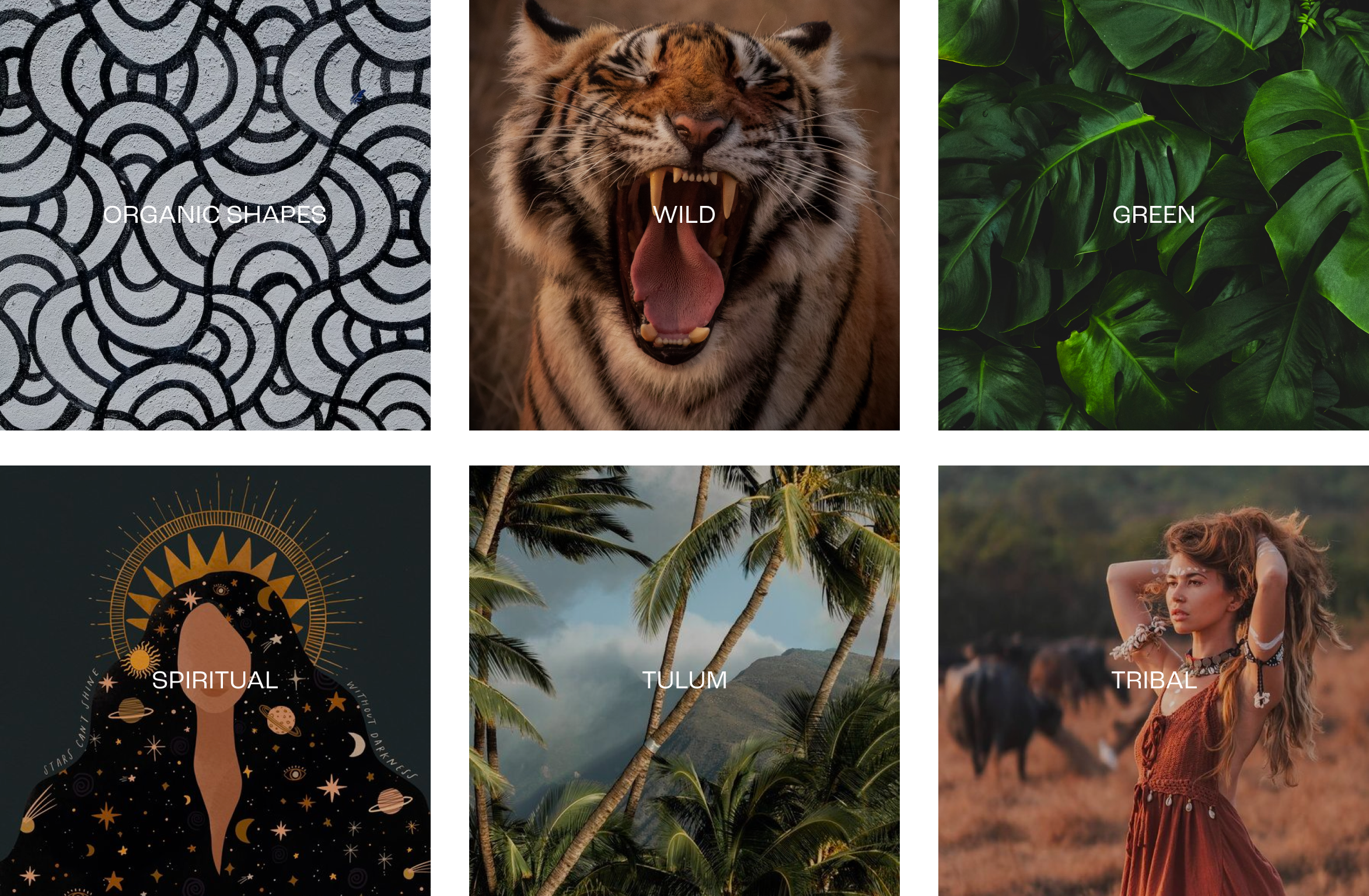
The mood board aimed to encapsulate the founder's vision for her dresses and brand. Organic, hand-drawn shapes symbolize the craftsmanship behind each dress. A tigress embodies the wild feminine energy, green leaves represent Earth and healing. The brand's conception originated during the founder having a spiritual moment in Tulum, drawing inspiration from tribal fashion.
The Name

The idea of the brand emerged during the founder's spiritual journey in Tulum, Mexico where time seemed to halt, and she embraced the present moment. Thus, we coined the name "Aqui," meaning "Here" in Spanish, to inspire women wearing the dresses to live in the moment, connect with themselves, and manifest their purpose in life.
Combing the concept of being here and living moment while wearing the dress gave birth to the slogan “Wear the moment” and the “wear'“ concept found it’s way to the website domain “wearaqui.com” and social media pages @wearaqui as the name “Aqui” alone was not available.
The Logo
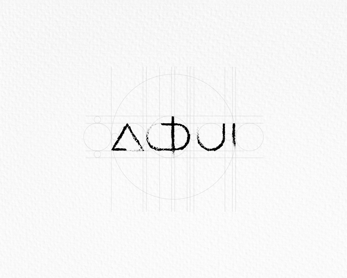
The logo aims for a wild and organic appearance, with letters crafted like scratches from a tigress. The A is shaped as a triangle, a significant form in spirituality, all carefully designed in golden ratio proportions.
Blending the idea of being present and living in the moment while wearing the dress resulted in the slogan “Wear the moment.” The “wear” concept seamlessly transitioned to the website domain “wearaqui.com” and social media pages @wearaqui, as the name “Aqui” alone was not available.
The Colors

Emerald takes center stage as the hero color, symbolizing nature and healing, accompanied by Spanish Gray, representing Earth and grounding in the present moment. Mexican Red serves as an accent for sale, details, and essential messages.
Typography
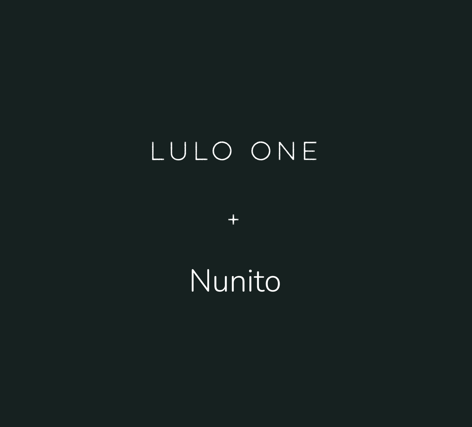
The logo exudes a wild and raw energy, so we aimed to strike a balance with a luxurious font, reflecting the high quality of the dresses. Lulo One takes center stage for titles, while Nunito ensures readability for content like product descriptions.
Art Direction for Photography

We aim to convey a story beyond the dresses — one about experience, being in the moment, and connecting with nature and your true authentic self. Instead of a traditional studio photoshoot with white background, we opted for shooting in natural settings, particularly environments reminiscent of Tulum, the birthplace of the brand.
Art Direction for UI
The aim is to immerse the visitor in nature immediately, letting them envision how they could look in the dresses in various moments. The font Lulo One is consistently used in uppercase with an inspiring tone of voice, and the tigress scratch is featured on the top bar. Combining the keywords derived from the mood board.
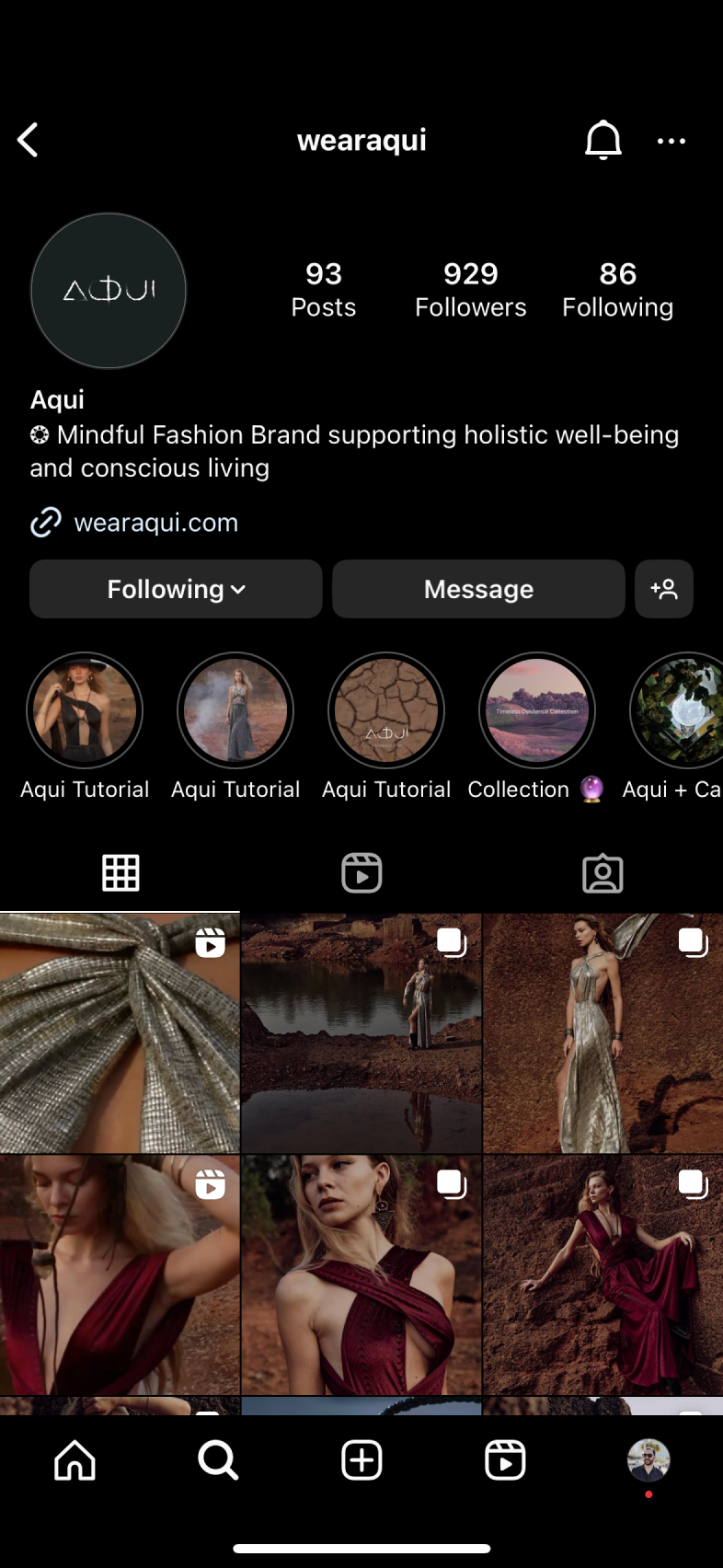
Art Direction for Social Media
Again, the emphasis remains on moments and experiences in nature rather than the dress itself, with a consistent theme across a grid of three posts.